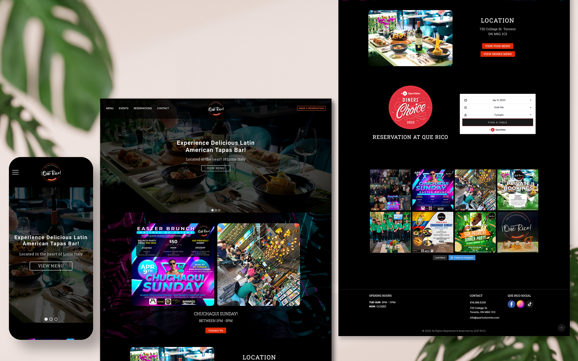
Project information
- Category: Identity, Print and Website
- Client: Qué Rico
- Project date: August, 2023
- Project URL: www.quericotoronto.com
- Used: Adobe Xd, Adobe Illustrator, Adobe Photoshop, HTML, CSS, JavaScript, Wordpress
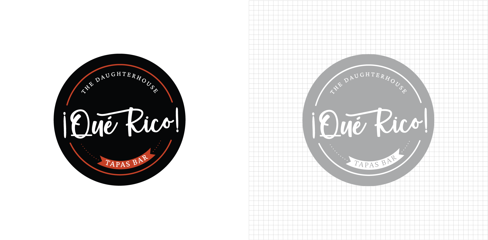
Utilizing an inverted exclamation mark signifies emphasis in the Spanish language. The phrase "Qué Rico" conveys not only the meaning of "How Delicious," but also alludes to an alternate interpretation of "Rico" as "rich." The logo was meticulously crafted with handwritten typography to capture the essence of richness and the delightful experience associated with savoring delectable Latin cuisine. A predominantly orange color palette was employed to evoke the fiery passion characteristic of Latin America and to suggest the tantalizing spiciness of the dishes.
